Every few weeks someone sends us a site that “has Arabic” and asks why Arabic visitors leave faster than English ones. Usually the answer is visible in the first screen: flipped icons, a Latin font stretched over Arabic letters, and a menu that reads in the wrong order.
Direction is a layout decision, not a CSS switch
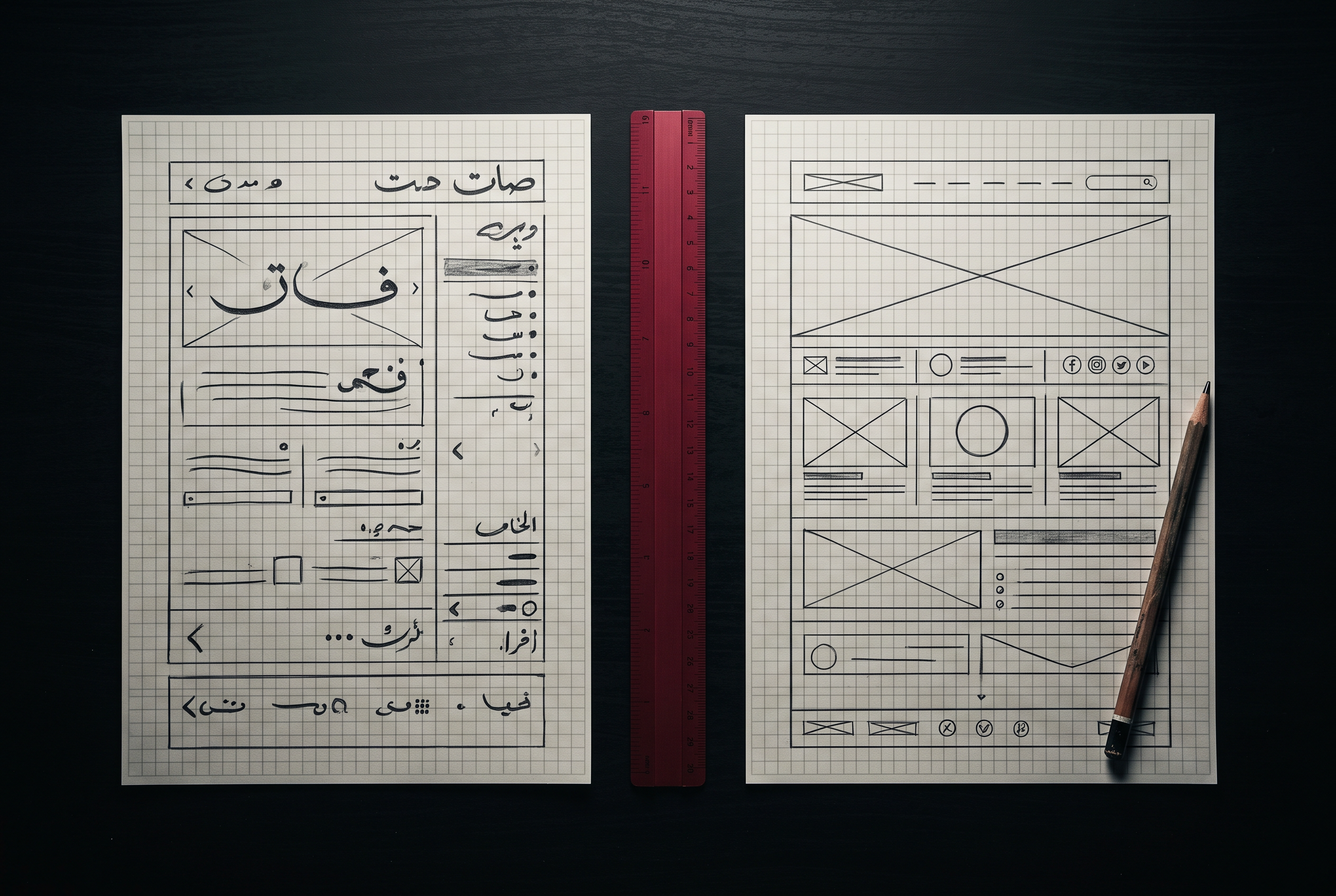
Right-to-left changes where the eye lands first. Hero text, arrows, sliders, progress steps and breadcrumb trails all need to be reconsidered, not just mirrored. Some things should flip, like arrows. Some should not, like logos, phone numbers and video controls.
Pick an Arabic typeface on purpose
Arabic letters sit lower and run wider than Latin ones, so headlines set at the same size look cramped or oversized. We pair fonts deliberately, adjust line height per language, and test the longest Arabic headline on a phone before anything is signed off.
The parts people forget
Form validation messages, date formats, number formatting, the “404” page, email confirmations and the search results page. If any of these appear in English on the Arabic site, the visitor notices immediately. We keep a checklist and go through it page by page.
Search engines see two sites
Each language needs its own titles, descriptions and hreflang tags so Google shows the right version to the right searcher. Getting this wrong is why some bilingual sites rank for English queries and vanish for Arabic ones.
Bilingual is not a feature you add at the end. It is a way of building the site from the first wireframe.